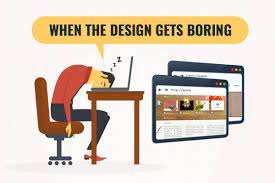
27 Sep Signs Your Website is Boring
There’s a time and a place for boring (like shopping for groceries or a maths lecture), but one place it absolutely does not belong is your website. Your website is the digital Mecca for your company and a first impression of how exciting and relevant you are to potential clients.
With so many interesting, interactive and informative websites out there, a boring website is a sure way to lose traffic and new business. Luckily, there are several signs that your site is boring and easy ways to fix it.
1. Your home page lacks a focal point
The home page is your introduction to potential clients. It needs to entice them and leave them wanting to explore more. Home pages that have too much information just look cluttered and those with too little information are wasting a valuable opportunity. For advice from Web Designers Galway, go to Ryco, a leading Web Designers Galway firm.
2. Your website is out of date
Website trends move fast, and it is important to keep up with the latest developments in order to remain competitive. An out of date website communicates a sense that your business is behind the times or closed (which is not the message you want to convey).
3. Your average time on page is low
The longer you can get visitors on your site, the more likely you are to convert them into clients. If your average time on site is low, it could mean that your website is boring. There are many things that can be done to improve the experience for your visitors, including regular blog posts, the use of stunning images and ensuring that your site loads quickly.


